Fun to highlight for #GAAD #GAAD2024
Accessible Prescription labels: work in WA
The WA Council of the Blind the National Federation of the Blind of WA Health Equity Circle the WA State Pharmacy Association and other advocates have been working with the WA Pharmacy Quality Assurance Commission on rulemaking to make prescription label information universally available in WA in formats that are accessible to patients who are blind, low vision, print-impaired and / or limited English.
This post is a small practical illustration both of some accessibility principles such as working links to accessible websites and alt text on images and of why accessible labelling. This is very limited information about one fairly simple daily routine. Imagine the challenges for anyone who has even more complicated medications, restrictions, choices of variable dosages. And this does not even touch many different complexities about how and where medications are dispensed, how pharmacies operate in communities of different sizes or a whole bunch of topics interested parties are slogging through--even before we get to reimbursement.
This post is pretty nerd level. By no means, though, does it address every quirk of every content development tool on the market.
The pharmacy customer here is a native English speaker but is aware for instance of what once means in English, one time per day, compared to once in Spanish, 11. The pharmacy customer here is low vision, also aware of but the need for visual data resources for sign language users, but not well-informed about further detail.
In this case the consumer has not requested any adjustment to how medications are dispensed. The consumer is aware of options to make such requests but has note opted to do so.
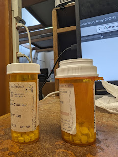
Two Blood pressure medications
 |
Two prescription bottles
with different shaped lids |
The key point:
Take one of each medication each day.
Do not take two of one medication and none of the other.
This works as long as one has enough vision to check each time there is a refill and to put each refill into its corresponding container.
Imagine the patient safety, ER Visits and tests that might result if a patient messes up.
Now two eyedrops. One taken twice a day. The other once at bedtime.
It is good to space the 3 drops evenly over the day.
SOMETIMES eyedrops come in different shaped bottles. Sometimes different drops come in identically shaped bottles. The current solution, store the twice a day drop in the prescription container with the larger lid and the nighttime drop in the container with the smaller lid. Again, an easy tactile way to be sure one is getting the right eyedrop at the right time.
For an extra clue in sorting the prescriptions at home: the nighttime drop is dispensed from a refrigerator and this customer refrigerates the extra months when receiving a 3-month refill.
One big reason to push for full language access: prescription information involves both the 6 standard SIG elements but also possible side effects and contraindications. Consider a blind person from another country who might for instance want more information before taking medication for a mental health condition.
Products on the market to support language access vary about whether or not they also provide in-language versions of the pharmacy insert, that document in tiny print that lists a bunch of things about side effects, "ask your doctor" points, and all that cute pharmacology info of deep interest to a small segment of people.
 |
Two prescription containers
with different sized lids |
Some additional notes:
In browsers, a sighted person can hover a mouse over an image to see what if any alt text is present.
If uploading an image to a social media platform, make sure to use the platform's tools to add alt text wherever available. LinkedIn has a 120-character alt text size limit. If something needs more than 120 characters, consider linking to a full document or longer description.
Photo captions are great. Alt text also matters.
However, if there is no alt text, a screen reader may simply read the filename of the uploaded image. MANY filenames have ugly sequences of numbers. Rename these ugly filenames please!
Some content development tools will by default just populate the alt text field with something like "image." #DoBetter than that.
Some platforms now also have options automatically to guess about what is in images. Don't leave the alt text up to the algorithms without checking first.
This post violates a suggestion not to put info in alt text that is not available to other users. No one is perfect.


No comments:
Post a Comment